Friday, November 30, 2018

8 Ways Probability is Used in Real Life

Dice Gaming Play Luck Chance Gamble Risk W 
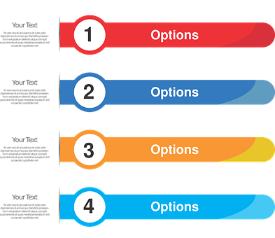
Probability is one of those topics we teach in a rather isolated manner.  I know for me, its thrown in here and there as I can fit it in but I never really address where we see it in real life.  As a matter of fact, this is another topic that would make a good infographic.

Lets look at some of the places students experience it in real life and might not even be aware of it.

1.  Weather reports usually give people the probability of rain, snow, clear, or fog.  I've listened to them but never thought anything about it.  If you hear that there is a 60 percent chance of rain, what that means is that same weather conditions produced rain for 60 out of 100 days.

2.  In sports, coaches look at certain statistics to determine who to play in a specific situation.  For instance if a baseball coach has two possible hitters, one has a .200 hitting average or 2 hits every 10 times at bat versus a player with a .400 hitting average or 4 hits every 10 times at bat.  Who would he choose?

3.  Insurance uses probability to decide how much to charge and people also look at the frequency of something happening to decide if they should get extra coverage.  One example is when you decide to get liability or comprehensive and liability based on how frequently something happens.  If 18 cars out of every 100 hit a deer, you might want both because there is an 18 percent chance of hitting one but if there is no chance of hitting a deer, you might only go with liability.

4. In games, people look at the possibility of getting something such as in poker there is about a two percent chance of getting three of a kind or a 42 percent chance of getting one pair in a hand of poker.

5.  Advertisers use probability to determine who should get which type of coupons such as looking at a woman within a certain age group is more likely to have a baby so send her discount coupons for diapers.  This is called targeted advertising.

6.  Horse racing tracks use probability to weight the betting odds so the race track owners cannot loose.

7.  Machine learning uses probability to determine the chances of the next word is as you type a text on your phone or if you type a word in a search engine, the search engine uses probability to determine the one you want.  For instance if you type in the word "cricket" it will show the most probable meaning such as the insect, the game, or the phone company.

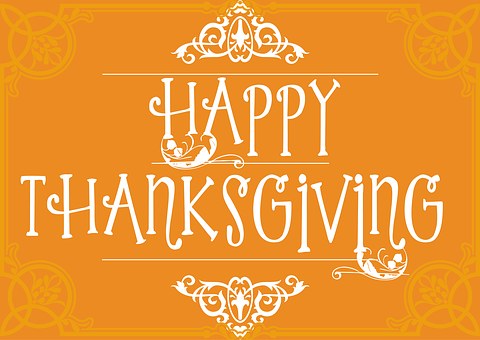
8.  Stores use probability to order and stock shelves so they don't run out.  For instance, they want to stock up on turkeys, ham, cranberry sauce, and other traditional goods for the Thanksgiving/Christmas season or chocolates and eggs for Easter.

There are so many more ways probability is used in real life but these eight are just a quick look at how probability is used in ways we don't think about.  Have a great day and let me know what you think.


Thursday, November 29, 2018

Using Legos to Find LCM

A  4 block and a 6 block.
 As you know, I've been working on ways to use Legos in the high school math classes.  Sometimes, we have to teach skills to students who are supposed to have learned them prior to arriving in high school but didn't for whatever reason.

I've looked at scores for my students and too many are testing in at a 4th, possibly 5th grade level and have managed to get passed grade to grade without the skills.

My pre-algebra class is on their second week of learning LCM because I discovered that too many have been confusing GCF and LCM.

I've tried the fraction strips, listing multiples, factoring trees and many of my students are struggling to learn how to find the LCM.  Some one in elementary taught them something called the butterfly method where they cross multiply the numerator and denominator of two fractions and then multiply the denominators together for the common denominator so they multiply the two numbers together to get the LCM.

My objection to the butterfly method is that it only works if you use two numbers which are some of the smaller numbers or contain a prime such as 4 and 7, otherwise if you have 8 and 4, you end up with a LCM that is too high.  Yes I'm mentioning fractions because LCM and fractions go hand in hand.

I've added Legos to find LCM.
So I pulled out my small set of Legos and started playing with them.  I chose 4 and 6 because those are some of the multiples students have to work with when first learning the process.

First thing I did was lay out a block with 4 circles (a 2 by 2 block) and for 6, I used a four block and a two block to make 6.  You can see it in the first photo.

Second, I added enough four blocks and six blocks until they were exactly the same size as seen in the photo to my left.

They can see they need three 4 blocks and two 6 blocks to get to the lowest common multiple. I think this may provide a better visual than the strips or the butterfly method.

I am hoping they "see" how the numbers relate.  Only time will tell.  Let me know what you think, I'd love to hear.


Wednesday, November 28, 2018

Ways to Use Infographics in Class

Infographic Design Vector Image Infographi Yesterday I went over the elements needed in a good infographic and today its time to look at how they can be used in the classroom.  Since the number of infographics has increased, its important students learn to read and interpret the information contained in them.

Its also important students learn to use infographics in as many ways as possible.  So lets look at ways they can be used.

1.  Find infographics which compares information to inspire discussion and debate.  The inforgraphic should show two sides of the question such as wild vs farmed salmon.  

2. Let students create their own infographics on a topic such as Black Friday sales or Flowers sold on Mother's day.  Creating infographics helps improve both computer skills, creativity, and critical thinking skills.

3.  Use an interactive infographic as a quiz or activity in the class so students have to work their way through it.  This type of activity improves literacy, math skills, and reading ability.  This is one way to gamify the classroom.

4. Use the infographics as visual aids in the classroom because they combine images with useful data so its short and sweet.  The infographics contain only essential information in an organized form and meets several standards on learning to read information presented in a variety of forms.

5. Rather than having students write down what they know on a topic, have them create an infographic instead because they cannot fall into the trap of writing everything they know in the hopes of getting some points.  They have to get to the essence of the material.

6. Instead of a homework assignment, assign them to create an infographic.  It might be on the three ways to solve systems of equations and the process to select which one is best in what situation.

7. Infographics can be used as the visual for a presentation so all the information is in one place on one page, thus eliminating that awful moment when nothing works or it freezes.  The infographics allow the presenter to have a flow to the presentation based on how they put it together.

8. Use the infographic as a way for students to report on a topic.  It has been found that infographics can be used to transfer information about a topic faster and more effectively than straight text as long as the inforgraphic is well designed.

Yes, these can all be used in the math classroom with just a bit of thought.  Let me know what you think, I'd love to hear.  Have a great day and I do plan to revisit this topic later but tomorrow, LCM's and Legos.

Tuesday, November 27, 2018

Infographics?


Info Infographic Design Information Infogr Yesterday and this past Friday, I suggested students create infographics on the sales for Black Friday and Cyber Monday. Aside from the fact that infographics are becoming more and more popular, one may wonder why we should teach this skill in math classes.

By definition, an infographic is a quick way of presenting information, graphs, or data in a visual way that makes it easy for the brain to see patterns. 

Furthermore, a well designed inforgraphic makes it easier to communicate data to others.  In addition, infographics can be used to introduce new topics, spark discussions, or provide a starting point for more in depth research.

In a sense, creating an infographic is like writing a paper.  The author has specific information they wish to convey to others.  They need to choose the right visualizations or images,  good color combinations with proper spacing and boarders to attract the eyes and make it easy to read.

There are three main parts of the infographic.  First is the visual made up of color coding, graphics and reference icons.  The second is the content with time frame references, statistics, and information on where the statistics were found.  The last part, is the knowledge with facts and deductions.

One way to help students learn to create good infographics is to find some and share them with the students one at a time.   Ask the students to analyze what is good about each one, what could be improved.  Let them discuss what each designer did well in regard to creating the right balance between graphics and text.  Ask if these infographics have all three parts and if so is the information in depth or simple.

Once they have had a chance to see a variety of infographics, it is time for them to think about creating their own. There are five steps to think about when they begin designing their own infographic.
1.  Create a flow chart or skeleton of the information so students know how the information should be grouped and how it is related to each other.
2.  Assign a color scheme so the information is easy to see and is not overwhelmed by a mish mash of color.
3.  Choose the appropriate graphics that tie everything together.  If you need icons, this is where you think about them.
4. Research the data to make sure it is correct and supported by sources.  The best ratio for data to graphics is 1:1 so you want to make sure you have an equal amount of data and graphics. Furthermore, make sure you know who your audience is because that will impact much of the data and graphics you choose to use.
5. Make sure the knowledge is placed so people will be able to make deductions easily.  Do not make someone feel stupid when they read it.

 It is important to plan this all out on paper prior to creating the actual infographic much like a film maker uses a story board to plan a film or animators use a story board when animating a cartoon.  Its best to plan it all out in detail.  Keep your eyes peeled for ways to use infographics in class as part of your teaching.  Today was focused on helping students learn to create their own but they can be used as part of your teaching.

Let me know what you think, I'd love to hear.


Monday, November 26, 2018

Cyber Monday Stats.

Cyber Monday, Sales, Discount, PromotionThe term Cyber Monday has only been around since 2005 when it was coined to describe the buying done on the Monday after Black Friday.

This date provides a great set of information for students to make another infographic or perhaps a wonderful graph where students can calculate the yearly growth.

 I obtained the information from this website.

Cyber Monday spending for the years 2005 to 2017.

2005: $484 million
2006: $608 million
2007: $733 million
2008: $846 million
2009: $887 million
2010: $1.028 billion
2011: $1.25 billion
2012: $1.46 billion
2013: $1.74 billion
2014: $2.04 billion
2015: $2.28 billion
2016: $2.67 billion
2017: $3.36 billion

In 2017, the purchases on Cyber Monday were as follows:

22% sought deals on clothing.
21% wanted deals on tablets/laptops/PCs/TVs
17% looked for deals on smart-home gadgets.
15% wanted deals on gift cards
14% preferred looking for deals on toys.
11% sought deals on travel.

The top two retailers who profited from Cyber Monday are:
Amazon who secured about 60% of all Cyber Monday sales via 108 million visitors and 8 million transactions.
Wal-mart was second with only had 8.5% of the sales via 32 visitors who made 1.2 million transmissions.

A few facts. 
1. In 2017 81 million people shopped online on Cyber Monday.
2. Cyber Monday has become more popular than Black Friday with a 71% to 69%
3. 75% of the shoppers used a home computer, 43% used a mobile device and 13% used computers at work.
4. 88% in the 18 to 34 age group planned to shop on Cyber Monday while 74% in the 35 to 54 age group planned the same.

Have fun letting students loose with this information to create graphs and infographics so they can learn to communicate mathematical information.  Let me know what you think, I'd love to hear.  Have a great day.

Friday, November 23, 2018

Black Friday Project.

Black, Friday, Black Friday, Sign I just realized how perfect Black Friday is for a project in Mathematics.  One of the dictates of math is for students to learn to communicate in a variety of methods.

One such method is to use infographics to communicate information in a visually satisfying manner.

In addition, infographics often use statistics as the basis for information included.  One time, I had fun creating one on what happens the first day after going onto Daylight Savings time.

Black Friday, besides being one of those sales days where stores open at 5 or 6 in the morning, is full of statistics perfect to communicate via infographics.  Look at these numbers:
1. In general 30 percent of yearly retail sales occur between Thanksgiving and Christmas.  In some areas such as jewelry, it can be 40 percent of all sales.

2. In 2015 - 74 million people shopped in stores on Black Friday
    In 2016 - 101.7 million shopped in stores on Black Friday
    In 2017 - the figure declined 4 percent.

3. In 2015 - 102 million shopped in stores for the whole 4 day weekend.
    In 2016 - It jumped to 134 million.

4.  In 2017 - 7.9 Billion online sales.  40% were made from mobile phones
     In 2016 - on line sales were 18% less.  calls from mobile phones were 29% less.

5. On average each shopper is expected to spend an average of $1007.24 which breaks down as follows:  $637.67 on gifts, $215.04 for food, decorations, etc, and 154.53 on seasonal deals.

6. Based on 15 years of data, annual sales increased on average 2.5 percent.

7. Data found here for 15 years worth of sales beginning in 2002. This information could also be used to create graphs showing the overall increases and decreases for use in the infographic.

8.  In 2017 between 500,000 and 550,000 seasonal workers were hired.
     In 2008 - 263, 820 workers were hired.
     In 2013 - 764,750 workers were hired.

Lots of great data to convert into infographics.  Let me know what you think, I'd love to hear.  Have a great weekend.

Wednesday, November 21, 2018

Farmland as an Investment.

Cereal, Countryside, Crop, Cropland  I was reading my favorite magazine the other day when I came across an interesting article on how farmland is considered a great investment based on its return. 

In 1970, an acre of farmland in Iowa ran just over $400 but that same acre jumped to just over $7000 in 2016.  that is a huge increase.

(7000-400)/400 = 1650% increase per the standard mathematical increase formula.

According to the article, farmland as investment has outperformed most other assets for the last two decades offering a 12 percent return each year.  This has lead to investors bidding on proven properties for their portfolios.  So far about 30% of the available land is owned by investors and leased out to farmers.  

You may wonder how this happened.  Its simply economics because many farmers are aging, The cost they can sell crops is less than they need to be financially solvent, the interest rates have gone up, and people want their money out.  In addition, some crops such as corn are being used as an additive to fuel.  Interesting observation, as the price of land has escalated, the amount of ethanol being produced has grown at about the same rate.

Over the next 5 years, according to another article it is predicted that another 92,000,000 acres of land will come up for sale, or an amount of land that is about the size of Montana.  It is expected this land will be snatched up by investors such as retirement or pension plans, and others rather than being purchased by individuals.

In 2016, the total amount of land in the United States under crops is 253.1 million acres.  This means if 30 percent is owned by investors, then 253.1 x .30  or about 76 million acres so that would be (92 + 76)/253.1 or about 66% of the farm land owned by investors.  On the other hand, I saw a different figure which stated only 10 million more acres would be available over the next 5 years for purchase so that would be (76 + 10 )/253.1 or about 34 percent. 

Both articles agreed on the amount owned by investors but differed on how much will be available for purchase over the next five years, I looked at the percentage for both.  What I see is that this article is great for having students calculate the actual numbers of acres owned by private investors so they could take this information and create a slide show using the information.

This helps teach them more about the rate of return, economics and provides students with a real world application of mathematics.  Let me know what you think, I'd love to hear.  Have a great day.

Tuesday, November 20, 2018

Scale models.

Three Masted Sailing Ship Christopher Colu  Usually in most textbooks I've used, problems involving scale models all seem to revolve around planning a garden, drawing plans for a house, or even figuring out the length of a real car or train based on a scale model but there are other things we can use which might provide students with an understanding of other subjects.

For instance in science, they learn about the layers of the atmosphere, peer at a diagram in the book and move on but what if we took time to help them draw a picture in math while studying it in their science class?  Might that show students there is a connection between the two classes?

Since most of the world uses metric including the science class, its best to draw this on centimeter grid paper so students become used to using metric.   First step is to have students draw a circle with a radius of 6.378 cm in the center of the page.  This represents a scale of 1cm = 1000km so a radius of 6.378cm represents a real radius of 6378 km.

99.999% of the atmosphere is within the first 100 km above the planet so you have students draw a small line about 1 mm above the earth.  That shows the students a reasonable visual of how thick the atmosphere is around the earth.

More specifically if air pressure is 1 kg per square cm at sea level.  If you move upwards to around 5,500 meters or 5.5 km, the pressure drops to half of what it was at sea level.  Go up another 5,500 meters or 5.5 km, its dropped in half to about one fourth of what it was at sea level.  Most planes fly between 11,000 and 13,000 km and if you get up to 30 Km above the earth, you are above 99 percent of the atmosphere.

If you have the students create a thin strip to show the layers of the atmosphere, the tape from an adding machine is great for that purpose or a strip of graph paper with 1 cm = 1 km works equally well.  The layers would be as follows:

1. The troposphere is about 15 km thick.
2. The tropopause is about 5 km thick.
3. The stratosphere is about 30 km thick.
4. The mesosphere is around 40 km thick.
5. The ionosphere is 260 km thick.

This activity shows how the atmosphere is divided up but its nice for students to see that the whole atmosphere is not that thick. 

Each activity involves creating scale models, each with a different scale.  It would be quite difficult to see the different layers of the atmosphere if the scales were the same.  I believe this shows the need for different scales.

Let me know what you think, I'd love to hear.  Have a great day.


Monday, November 19, 2018

More on Making Thinking Visible.

Young Woman Girl Lady Female Work Working  Many students find it difficult to explain their thinking when it comes to mathematics.  Often they can tell you what the next step almost by rote but they cannot always tell you why they need to do it.  This can be especially difficult for ELL students who may not be as fluent as other students.

Some students when you ask to explain their thinking often give you a look like "Why do I need to think about it?  I just need to follow the steps and I'll get a right answer!"

They don't seem to understand that thinking leads to better understanding.  There are ways to encourage and help students develop the ability to explain their understanding.

1.  Connect-Extend-Challenge which adds a layer to instructing students in a new concept or skill.  Instead of just teaching the skill, ask them how it connects to other problems they have solved because it requires them to access their prior knowledge.  Once they begin connecting the problem with other problems, ask them what is new before asking them to explain how this problem extends their knowledge and thinking.  The final step is to have them identify the challenges they faced learning the material.

2. Claim-Support-Question is designed to help students make a claim, recognize patterns, figure out generalizations, and learn to provide evidence to support the claim.  The teacher makes a claim such as "all multiples of four are also multiples of two".  Students gather in small groups to discuss if the claim is true or false.  They must provide evidence such as manipulatives, drawings, etc to support their position on the claim.  The last step is to have students list the questions that were raised during the discussion that have not been answered.

3.  See-Think-Wonder is for students to look at a visual pattern while explaining what they see.  They talk about it and then think about the next step in the pattern before discussing their choices.  The final step would be for student to express what they wonder about in regard to the pattern.  Do they wonder what the 100th step is or perhaps the 50th?  This is where they talk about it.

These are just three routines which can easily be implemented into your daily routine to help students learn to make their thinking visible and to help them increase their conceptual understanding of mathematics.

Let me know what you think, I'd love to hear.  Have a great day.


Friday, November 16, 2018

Slope in Context.

Question Questioning Unknowing Unknown Puz  As we know most of the mathematics taught in school is done in isolation with no connection to the real world.  We even teach things like two step equations as totally separate from a point on line.

If we could spend more time relating the math taught to the real world.  For instance if we could show how easy it is to calculate the orbital velocity of the space station.  Would that capture our student's interest.

Unfortunately, most of the time when we teach math, the "real world" problems used in most textbooks have an artificial feel to them even if they are based on reality because they seem rather isolated.  Providing context that feels real is important because it helps students answer the question of "When will I ever need this."

For instance, when we teach slope, we can make it so much more than just teaching the slope formula just to have students calculate slope based on two points shown on a coordinate plane.  This is not an authentic task.  It really provides no connection to situations in real life,  especially since slope in real life appears in many different forms.

Most students can tell you there is slope associated with roofs but they don't know much more than that.  They are unaware slope of a roof is called pitch and refers to the "rise" of the roof over the "run" based on a foot or 12 inches.  They don't know that most roofs have pitches of between 4/12 or goes up 4 inches for every 12 inches horizontally and 9/12 or rises 9 inches every 12 inches.

Furthermore, the pitch of a roof determines or eliminates the type of roofing material that could be used.  For instance, if the pitch is only 2/12, you don't want to use asphalt shingles because its  easier for the water to seep in but you wouldn't want to use rubber membranes on the normal pitched roofs.  On the other hand, a roof with a pitch of 2/12 is not going to be used in an area of heavy snow because the snow could build up so the weight causes the roof to cave in.  If the roof is too steep, the snow could slide off and hurt someone below.

Another use of slope is when building a house.  If you build a house on the side of a hill as many do in California, you'd use a different technique than if the land is much flatter.  One way to get a better idea of the contours of the land is to create a cross-section based on the elevations from a map.

A cross-section gives a wonderful visual representation of the information on a map and allows students to "see" what it looks like, even if they've never been there.  In addition, students have a chance to learn how a geologist might use this information versus an architect, versus someone planning a road versus planning a ski resort.

If you are a land developer, you are not going to build your gated community at the bottom of a steep hill because the water would rush down and possibly flood the area. If you do, you have to consider how you are going to keep that from happening.

So the next time we teach slope, maybe we could take time to do a couple of activities which would expose students to these real world situations so they see the use for learning about mathematical slope.

Let me know what you think, I'd love to hear.  Have a great day.


Thursday, November 15, 2018

The Math of Dungeons and Dragons.

Dice, D D, Dungeons And Dragons, Trendy
I have friends how played Dungeons and Dragons every single weekend. They'd disappear into a dorm room Friday night and reappear on Sunday sometime looking like death warmed over but it was their thing.  They got me to play it one time using their rules and I ended up with a +1 knitting needle. 

There have been a couple of movies on the topic along with some books but people still play the basic game and according to new information, it appears to help improve overall scores in children.  Don't think its just students who are above average. The game has hooked those who are struggling.

In general the game requires so much to do.  It encourages players to imagine a three dimensional world in their mind's eye while being lead by the Dungeon Master or DM.  Its a collaborative world building experience encouraging the use of geography via map reading, recursive mathematics every time they roll the dice, use addition and subtraction via modifiers, science for weather, ecology, climatology, chemistry, physics, and so many other skills.

In regard to mathematics, the game contains so much.  Players need it to modify their rolls by consulting charts and tables, calculate current rates for currency exchange, and figure out the number of experience points they could get. 

Their use of math begins when they are creating their character because the results of the dice rolls helps determine the type of ability the character has. If you are a fighter you want a high number to provide strength but if you need stealth, you'll go for numbers to give you that.

Math is also used to determine the order players carry out combat, sneak past an enemy, bluff, and just about any other action.  The higher the levels, the more complex the math.  Furthermore, it allows students to learn more about probability theory without knowing they are studying it. 

If a player is rolling one twenty sided dice twice, each roll is an independent event because the first roll does not influence the outcome of the second roll.  This uses the math formula p(A and B) = p(A) * p(B).  If the probability of rolling a 20 is 1/20, then the probability of rolling a 20 each time for two rolls is p(A and B) = 1/20 * 1/20 or 1/400 = 0.0025.

In addition, one can apply the binomial theorem to this game.  Basically, how well a player does in the game is determined by the roll of the dice.  Let's say the student is cornered, has only four rolls left but needs to get a 20 on three of those rolls.

So there are four trials left with 3 of those being successful.  So the formula for P(successess) = (n!/x!(n-p)!) *p^x *(1-p)^(n-x) So mathematically this looks like (4*3*2*1)/(3*2*1*1) * (1/20)^3 *(19/20)^1 = 0.000475 of being successful.

If anyone thinks D & D is for nerds only, its not since it provides skills in a cross curricular way that many students find enjoyable and engaging.  Let me know what you think, I'd love to hear.  Have a great day.

Wednesday, November 14, 2018

Minecraft Revisited.

Minecraft Castle Render Video Game Buildin The last time I looked at Minecraft was before Microsoft bought them out.  So I thought it was time to revisit it.  Minecraft is still a program that captures student imagination as they play and design things. 

So they have created lessons using minecraft so students can put their knowledge together.  The site has a new look and the lesson plans are organized according to subject and age grouping. 

I chose math when I went to the front page of the web site.  As soon as it landed on the math page for lesson plans, the page had suggestions for lessons to look at for beginner lessons, featured lessons, lessons for fractions or area and volume.  At the bottom of the page is a see all lessons buttons.

I looked at a few different lessons to see how they were set up, what they contain and such.

1. Velocity time graph and displacement designed for students aged 11 to 18.  It is labeled as being for math, economics, and science.  The lesson its self has the learning objective, guiding ideas, student activities, performance expectations, and an extension. 

The lesson begins by having students read velocity-time graphs to learn more about what they look like.  Then they are asked to create  a velocity- time graph on graph paper to represent what it would look like in Minecraft before actually building it in Minecraft.

Once its created and the student makes sure it's correct, they then use the mathematical equations provided in the guiding ideas sections to prove the displacement from this new velocity-time graph.

2. The Prime vs Composite lesson is designed for ages 8 to 13 but could be used for older students if they need remedial lessons.   At the beginning of the lesson, they are asked to create a 4 by 4 array in Minecraft to see it takes 16 blocks to create it.  Then they are asked to create a few other arrays out of the blocks.  Once they are comfortable with this, they are asked to create arrays for certain prime numbers such as 13, or 23 but they can't do it except for a 1 by the prime number.

After a discussion on how composite numbers can be placed in arrays and prime cannot, students are given a task to complete to show they understand the difference.

3. Minecraft Slope for ages 14 to 18 years old.  This lesson is designed to introduce students to
the idea of how slope effects the effectiveness of a roller coaster.  Students are divided into groups to represent companies who are going to create a roller coaster for a new amusement park.  The ride will have three levels of slopes and needs to work.

After they've done the design, they are going to conduct an analysis of the project and the finished product. 

If you haven't been there recently, check it out to see if there is something you'd like to do with your students.  Let me know what you think, I'd love to hear.  Have a great day.

Tuesday, November 13, 2018

Polling Lessons

Polling Station, Poll, Election Day  Yesterday, I supplied a brief introduction to error margin and the math associated with polls, specifically political polls. Today we'll look at a couple of lessons on the topic.

First stop,  a lovely lesson from the New York Times on evaluating polling methods and results.  Its a lesson that deals with the results of a poll on texting and driving.

The lesson begins with the teacher asking the students the same questions found in the poll before tabulating the results of the class. Once these results are in, the teacher then shares the results of the official poll.


Students are then quizzed about their experience taking polls. As a final step, the class reads the article associated with the poll results before answering six questions associated with the reading.  What is nice is that the poll results also includes information on how the poll was done.

PBS New Hour has a nice lesson plan on the pitfalls of polling.  The lesson begins with a short video called the poll dance which introduces them to the concept of the validity of polls.  There is a hand out to fill out as the video is played.  It is suggested students watch the video the first time and fill out the handout, the second time through.

The second handout sends students to a website filled with polls for the students to look at one poll in detail, looking at things like things like the title and if the title relates to the poll itself, who conducted it, does it have a bias, how was the sample selected, sample size, etc so the the student has a chance to really examine the poll in detail.

The final activity divides students up into four groups, each group will examine an election from 1844, 1896, 1912, and 1926 to see how the predictions matched up with the election.  All though it students are requested to apply the information from the video to the activities.

The Civics Channel  has a lesson on the mathematics of polling where they go into detail on the 95% confidence level, diminishing returns, and errors in poll taking.  In addition, this is the first in a series of  activities on polling.  The next one has students applying the 5 W's of writing to the poll to find out more about who commissioned it, why did they, etc to make the student more aware of the motive behind the poll.  The third lesson looks at how a professional polling company works by looking at the methodology, the questions, and the report generated from a specific job.  This company is from Canada but much of the information is the same.

So if you want to look at polling in specific, check these lessons out.  Have a great day and let me know what you think, I'd love to hear.


Monday, November 12, 2018

Polling and Math

Ballot Box Box Poll Election Vote Ballot VEvery time there is an election, we are bombarded with polls giving predicted voter results. Sometimes they are pretty close, sometimes they are not but it is important for people to understand the statistics involved in polling.

There are two reasons to know about this topic, especially from a mathematical point of view.  First, sometimes polls are designed to steer people towards a certain position and second, sometimes the results are not properly interpreted by the reporting body.

Polls themselves are designed to determine the opinions of the population without asking everyone.  They ask a subset or sample whose opinion is believed to represent to whole population. One of the most important things is to select a sample whose diversity represents everyone.  Early polls from the 19th century relied on people responding with the ballots printed in newspapers.  Later on, they'd get the sample from telephone lists, automobile owners, or voting lists which means they were going with the opinions of the upper class, not the everyday man.

Often the polls quoted at news sites may be biased in that the news site is asking people to call in to register an answer and the sample comes from the views so it is not a scientific poll which takes great care to use a sample representing the population properly. 

All polls have a margin of error because the results could be different if a slightly different group of people were chosen for the sample so all margins of errors are expressed as + or - 3 %, which means that if the poll says that Dewey would beat Truman with 54% of the population's vote, they mean he might get anywhere from 51 to 57%.  In general scientific polls are considered to be correct about  95% of the time. 

If the error of margin is narrower, it means they had a larger sample.  The mathematical formula for the error of margin is basically 1/sqrt of the number of people in the sample.  So if you had a sample size of 1600 people it would be 1/sqrt(1600) or 1/40 = 2.5% error.  The error of margin helps you determine the accuracy of the poll.

Furthermore, many polls are broken down by ethnicity, gender, age, religion, or other subgroup so the over all sample size must have enough members of the particular subgroup so the error of margin stays reasonable.  Many times, the criteria for the perimeters of the poll are set by the person who designed the poll and that can effect the results.


To prove this, someone took the raw data from one pollster's prediction for the winner of the 2016 election and gave it to four respected pollsters to see how they used it to obtain their prediction for the winner of the presidential race.  The original person predicted that Hillary would win by one percentage point.  Three of the four predicted Hillary would win with an error margin of between one and four percentage points while the fourth predicted Trump by one percentage point.

As we know, Trump won. Why were four of the five wrong?  A lot of it has to do with how they designed their survey, determining likely voters, and adjusting for the actual demographics of the area.  All of these are done before the survey is done.

So today's I've covered a bit about the math behind polling as polling is so much a part of our lives and elections. 

Let me know what you think. I'd love to hear.  Have a great day.


Friday, November 9, 2018

Veterans Day Math

Remembrance Day, Ww1, Remembrance, War  The War to End All Wars ended at the eleventh hour, of the eleventh day, of the eleventh month  in 1918.  In 1919, President Wilson declared November 11, 1919 as Armistice Day but in 1954, it was changed to Veterans day as a remembrance to all the men and women who fought in World War II and the Korean War.

One way to bring the historical importance of Veterans day is with this activity from Yummy Math.  It has the stats for wars beginning with the Revolutionary war on up to the present.

Although the activity asks students to develop there questions, I see several possibilities for activities students can do with the numbers.

1.  They can create percentages for the those still living out of the total number who fought.

2.  Create percentages for those who died in the war out of the total number who fought.

3. Graph the number of people who fought in each war comparing it against the population of the time.

4.  Calculate the percentage of the population who performed active duty for each war.

5.  Calculate the percentage of those who died against the total number of people who fought.

6.  Based on the number of World War II veterans listed, what is the youngest age the survivors can be?  What about Korean War Survivors?

If you want to know how many veterans from World War II die each day, go here. Students can calculate how much longer it will be before the last surviving veteran passes so there are none left. 

You could also have students research how fast veterans from the Korean War are dying to figure out how long it will be before there are no more.  Be aware there are those who fought in both World War II and the Korean War.  I know a man who fought in both World War II and the Korean War.  He is 94, going on 95 but his health is slowly declining so I don't know how much longer he'll be around.

Have a great Veterans day. Let me know what you think. 


Thursday, November 8, 2018

The Math of Wrestling.

Wrestle, Wrestler, Sport, Martial Arts Its that time of year, when the local school hosts a huge wresting tournament with wrestlers from 10 different schools bringing middle high school athletes totally something like 140 competitors. 

It may not seem very large but every one of those students had to fly in via a small plane that holds no more than 9 passengers. 

I will spend 12 to 15 hours running the score board for one of the mats.  I have to keep track of the time, blood time, watch the ref for each and every signal, mark it down, and know who's up next.

There are things like a one point reversal, two or three points for near falls,  points for holding and not listening, and enough more to keep one on their toes.  The first year I did it, I had just wrote down what the ref did and wrote the number of fingers he held up but know, I know better.


I found this article which actually looks at a professional wrestler who made claims about his chances to win a three way competition back in 2008.  It is one of those things that is good for checking out for what is wrong with the statistics used.  Just to tease you, Scott Steiner claimed he had a 141 2/3% of winning against someone else's 8 1/3%.  Right off you know the claims are going to be interesting.

This lecture by Professor John D. Barrows explores how strength and power effects certain sports such as wrestling and gymnastics.  He covers gravity, mass, weight, Newton's laws, and your location on the earth in regard to your performance, along with levers and leverage which is especially applicable to wrestling. 

The Professor actually discusses the three types of levers and which ones are best applied in wrestling.  He discusses each class of lever in detail before discussing its application in wrestling.  Quite interesting.

The final article is on the mathematical connections to wrestling.  The author discusses a wrestler minimizing impact upon hitting the ground and the mathematical formula for pressure, the formula for momentum gained as the person falls, the "choose function" for drafting into teams, modeling the popularity of a wrestler based on various systems such as that of predictors.

Find your students who know every wrestler in the WWF and introduce them to the math via these three articles and see what interest you can generate.

Let me know what you think, I'd love to hear.  Have a great day.

Wednesday, November 7, 2018

Fractions and Multiplication

Addition Fractions Numerator Denominator P Over half of my current Pre-Algebra class do not know their multiplication facts which is making it quite difficult to teach equivalent fractions.

If I ask them what number 8 and 4 can go into, their first response is 2.  They confuse factors with multiples.  I suspect it might have to do with lacking consistent mathematical instruction in their earlier years.

I finally found a method that works fairly well but is not anything I learned  when I took all my teacher prep classes.  Those classes were so long ago and expected students to be fluent with their multiplication tables by 9th grade.

Since they are not fluent in their multiplication, its hard to use prime factorization to find the lowest common denominator.  So instead. I have them list the multiples of the denominator such as

4, 8, 12, 16
8, 16.

It is obvious from the list that 8 is the lowest common denominator for 3/8 and 6/4.

Next I have the child count how many multiples from the first one to the common which for the first line is 2 and 1 for the second line.

So the student then multiplies both the numerator and denominator by that number.

3*1/8*1 = 3/8 and 6* 2/4*2 = 12/8

Therefore 3/8 + 12/8 = 15/8 or 1 7/8.

Another way, I've had them look at lowest common denominator is through the use of basic fraction strips.  On one problem, they had 1/5 and 3/20 so of course their first guess was that 1/5 < 3/20 because 20 is bigger than 5.  I had them look at the strip of fifths while I drew it on the board.  I asked them if you could divide the fifths into smaller units so you had 20 of them.

About half the students had to look at their multiplication tables or count on fingers but they said if I divided the 1/5 into 4 pieces I'd  have 4/20.  So I rewrote the 1/5 as 1*4/5*4 = 4/20 so the problem now looked like 4/20 > 3/20.

So the above two ways are the ones I'm using to help my students learn to do equivalent fractions for addition, subtraction and comparison of fractions.  Will it work?  I don't know but I'm hoping.  Let me know what you think, I'd love to hear.

I'm hoping by doing it this way, they will connect their multiplication facts with the process but its hard when about half the students just want to guess.

Tuesday, November 6, 2018

Legos for Multiplying Binomials.

Some of you might have already seen this photo showing how to multiply binomials using Legos.

Although I made both terms positive, I could have easily made one or both negative by using two different colors. One would represent positive terms while the other would represent negative terms.

I defined terms as:
2 by 2 = x^2
2 by 1 = x
1 by 1 = one.

I created almost a lattice set up with the x + 2 across the top and x + 3 down the side.

The next line, I broke the x + 2 down into x + 1 + 1 and set one 2 x 1 under the x and a 1 by 1 under each of the ones.

I repeated the same for the x + 3 so each term was represented by a lego.

The last step was being the multiplication of x * x = x^2  which gives you a 2 by 2 block.  The next step was to multiply all the x's by the ones to give an x represented by the 2 by 1 blocks.  Finally it was time to multiply 1 by 1's or the single block.  It is easy to see the answer is x^2 + 5x + 6 just by counting.

If I had to, I could also multiply x^2 by x using the 2 by 3 lego block.  Again based on the visual representations, its much easier to see how the multiplying the various terms works and at the end, its easy to combine like terms.

Yesterday, I shared how Legos could be used to show combining like terms in a similar way.  It will be a while before I try multiplying binomials with my students but I'd love to hear what you think.

Have a great day.

Monday, November 5, 2018

Legos for Combining Like Terms.

Late last week, I received a set of lego type blocks in a variety of colors. I wanted to get a set that I could play with to figure out how they could be used in high school math classes.

One of the things my students struggle with is combing like terms.  Although they see the X^2, the X and the numbers, they do not see them as separate entities.

I do not know who to make it easier for them to see they are different.  So I  came up with the visual representation of the problems using Legos.

I decided the 2 by 2 are great for X^2 because they are square and easy to see a relationship.  The 2 by 1 blocks are perfect for X and the 1 by 1 blocks are great numbers.  Yes I stacked them and laid them on the sides so the number of blocks could be easily seen.

Although I used strictly positive terms in the example, I could easily have used negative terms by designating two different colors, one as positive and one as negative. If I used negative, I'd have them "take the negative" number away, leaving only the remainder in the problem.

Normally in class, I think I would have students actually combine the like terms from the left side and move them over to the right where the total is but for the illustration, I put them on both sides to see it in the picture.

I hope since the students can see the blocks are different sized for each term, it will be easier to see why X^2 can only combine with X^2 because they keep trying to combine everything into a single answer. If they try to do it with all the blocks, they won't fit nicely together and I'm hoping that makes it easier for them to learn to keep the sizes separate.

If I want, I can use the 2 by 3 for x^3 since it is larger than the x^2 and differentiates it from the x^2 block and adds one more possible term as they learn to combine like terms.

I honestly believe my students do not "see" the terms as something other than written versions with no real meaning.  I'm hoping by using these "manipulatives" students will begin to connect the written version to the visual.

I'm going to try it.  I'll let you know how it goes once I've tried it in my classroom later this week.  Let me now what you think, I'd love to hear.


Friday, November 2, 2018

Technology Improves Immediate Feedback Opportunities.

Home Office Workstation Office Business No  All those years ago, before technology, students usually had to wait a while before teachers graded and returned student work.  By the time it was returned a student could have learned to do it wrong and never recover from it.

Technology offers a chance for teachers to provide a more immediate feedback.  First of all, its important to know that feed back should be immediate, be specific and targeted, relevant while initiating deeper thought, and should be well-timed.

Immediate feedback makes it much more likely for the student to pay attention to what they are learning rather than seeing each assignment as something irrelevant.  In addition, immediate feedback can increase engagement while supporting student learning goals.

Some of the types of technology that provide immediate feedback include:

1. Quizzes via IXL, computer based program or other app can show the student how a problem should be worked if they make a mistake.  They don't have to wait for you to correct the quiz because the program does it.

2.  Use games to provide immediate feedback such as in Jeopardy, Kahoot, or Cool Math Games, etc where students play games testing their knowledge and they get immediate feedback.  I use Jeopardy a fair bit in class but with several adjustments.
        a.  I allow students to divide up into groups of two.
        b.  Each group has some sort of whiteboard they can record their answers on.
        c.  They must work together to find the answer.
        d.  I award points to every group who has the correct answer.  At first I'd award points to  
             whomever had the first correct answer but it was always the same ones who got in first with
             the correct answer so I changed that.
        e. I talk about how it should have been done or work it out if most people missed it.

3.  Use whiteboards so students can do problems on the boards, hold them up, and I do a spot check to see if they got it right.  I usually draw a smiley face to indicate it is correct or a frowny face for try again.

4.  Of course there is the frequent monitoring when they are doing the work themselves.  I've been know to suggest they check their signs or quietly point to line before moving on so they know where to look.

5.  Sometimes I assign a moderated movie from Edpuzzle with quizzes or short answers integrated into the clip.  The program allows me to check answers and send immediate feedback.

6.  Last but not least is Google with docs, forms, or slides which allow you to incorporate comments with immediate feedback to them.

Its the truly immediate feedback that helps students learn the material better. Let me know what you think, I'd love to hear and remember, these are not the only technology based items that provide feedback.  There are so many more.

Have a great weekend.


Thursday, November 1, 2018

Why Take Notes?

Write, Plan, Desk, Notes, Pen, Writing With all the digital devices that allow you to record spoken notes or even video tape the lecture, one sometimes wonders if it is still necessary for students to take notes.

For math and most other subjects, the answer is a definite YES!  In general taking notes actually do quite a few things.

First, taking notes helps you stay more alert because your body is active as you take notes. 

Second, taking notes keeps your mind active as you figure out what should or should not be written down.   Third, it helps emphasize and organize the information as it is present.  Finally it provides only the important information to study instead of wading through the entire lecture.

Jennifer Gonzales over at Cult of Pedagogy  looked at as much research as she could find on note taking and summarized the best practices from 30 years of research into one document.  The term notes can mean taking notes in a regular lecture or off videos, or in a flipped or blended classroom situation.

She found the following:
1.  Note taking helps students learn the material better.  When they write down notes or diagrams, they are helping build new pathways in the brain so that the information can be placed in long term memory. In addition, once it is in long term memory, it can be accessed, thus reinforcing the learning.

2.  It is suggested students take more notes rather than less because the amount of information a student retains is related to the amount of notes they take.  The more notes taken, the more complete the information which results in better learning.

3. It is important to teach students how to take notes because most people have no idea how or what to  record.  I remember in college, working hard to write down every single thing the professor said in the hopes I'd get all the important points.  If students are taught note taking strategies it can improve the level of notes taken and increases the amount of information they remember later.

4. When drawings are added to the notes, it increases the amount of material they remember.  Drawings can really help with concepts, terms, and relationships within the material.  I know in math, a graph or picture often explains a concept better than words.

5. If people revise their notes, add to them or even rewrite them to clarify the material, they often retain more information. It has been found that revision works better if done during scheduled pauses in the lecture or other situation, they remember information better and their note taking improves than if they wait till the situation is completely over.  Another thing they've found is if someone works with another person during the rewriting process, they increase the number of notes and do better on upcoming tests.

6.  It is better to include some sort of scaffolding such as guided notes where the teacher has created an outline with places for students to write in key ideas.  Another idea is to provide the notes with missing pieces of information that need to be filled in by the student. 

7.  Research has shown that if teachers provide fully completed notes  to students after the students have taking notes, it increases the amount of material learned.

8. One last thing, although it has been shown that students learn more when they takes notes by hand, it is still possible to take good notes on a digital device.

At the beginning of the year, I pass out composition books for students to take notes in.  This year, I am focusing on Cornell notes in the hopes that students will learn more.  I know that I arrange activities where they have to check their notes in order to get answers, thus I have built in review time.

Let me know what you think, I'd love to hear.  Have a great day.