Sunday, June 30, 2019

Saturday, June 29, 2019

Friday, June 28, 2019
Unit Rates.
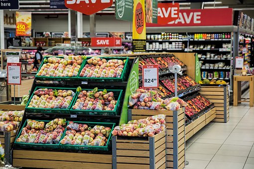 We all cover unit rates in the math classes we teach although most of the time the textbook loves to teach it in terms of price per ounce for some item such as pancake mix, juice, or laundry soap. Although it appears often in the grocery store, many people do not pay attention to this information so they do not see the cost per unit.
I spend time reading the little tags on the shelf when the store has them. Many small stores in Alaskan Villages do not have them so you can't use them to help shop.
One time, I was in town shopping for laundry soap. Not a hard thing except the unit breakdowns among the brands were not always the same. Some might have cost per ounce, while others had cost per box. I discovered that two smaller boxes cost less than the large box and you got more laundry soap with the two smaller boxes. If I hadn't checked, I might automatically have purchased the large one because the assumption is the large one is always more economical.
The grocery store is filled with more unit rates. Look at the produce when you buy it. So many items in the produce department are listed as a per unit cost such as apples are $2.49 per pound or plantains $0.99 each. These are unit costs. Check out cleaning supplies such as brooms or mops is a per unit cost.
If you look at most items such as material is a per yard or per meter cost, tires are per tire, and many tools are sold per item. Furthermore, if you look at nails and screws, they are sold per pound. Even cars are sold per item. Now admittedly, cars vary a bit according to the extras but usually the base price is the same.
I like the idea of giving a homework assignment for students to find different unit prices at various stores to show how there are unit rates all over the place, everywhere you go. Even gas is listed as a per gallon here in the United States.
Just a way to show students unit rates are all around us. Let me know what you think, I'd love to hear your thoughts. Have a great day.
Thursday, June 27, 2019
The United States - Population vs Area
 It is the season of wild fires and forest fires in the state of Alaska. The state chooses not to fight every fire because many break out in totally uninhabited area and it too hard to get in there. In the process of looking up some information, I came a cross an article in the Alaska Business Insider with some great information.
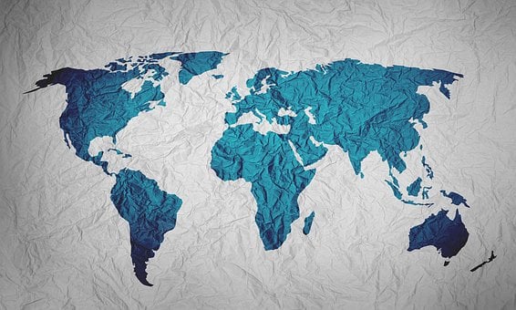
The article takes time to explain why some of the maps show Alaska to be bigger or smaller than it is in relation to the continental United States. According to this article, Alaska with its 663,300 acres is about 2.5 times as big as Texas, but the continental United States is actually 4.7 times as large as Alaska.
The article then goes on to compare the size of Alaska to Canada, Mexico, Greenland, and so many other countries. They pointed out that India is almost twice the size of Alaska, while Russia is ten times the size of Alaska. The article provides enough information for students to use in an infograph of relative sizes.
If you want to know how the area of Alaska compares with all other 49 states, this site has a ranking from 1 to 50 of all the states based on area. There is enough information to create a graphical representation as long as people realize that many states have under 1 percent of the area of the whole country.
If you rank the states based on population, Alaska is down toward the bottom but not at the bottom but if you choose to use population density instead, Alaska is the least dense state with one person per square mile. This information comes from this site.
Looking at how Alaska compares by area, population, or density opens up the door to discussing which should be used under what circumstance. It also opens up discussions on the best way to represent the information. I've seen much of this information visually displayed using state maps and coloring the state based on ranges but is this really the best way to do it?
This could also open up the discussion of why might you use a bar graph or pie chart. Often times, we tell students to display information using a specific format and type of graph but we never discuss why it should be done this way. This type of information is great for discussions on why certain information is better displayed this way or that way.
I looked at Alaska because its summer right now because there are many fires the state refuses to fight because they are in areas where no one is living and no one is in danger of being hurt. When you have a population density of one person per square mile, this puts it into a better context of explaining why the government chooses to do things this way.
It also explains why they might immediately put a wild fire out in California with a density of 255 per square mile. Let me know what you think, I'd love to hear. Have a great weekend.
Wednesday, June 26, 2019
Check For Understanding
 The age old way of checking for understanding in the past required one simple question. "Do you understand?". The standard reply "Yes, of course I do" regardless of the actual level of understanding. Unfortunately, we cannot rely on this question to obtain a truthful response.
Thus we have to rely on other ways to gauge the actual level of student understanding. One quick way I use is to have students use either a white board or a drawing app on a digital device where they work out a simple problem and raise the board or device. above their heads. A quick look and I can see who has the problem done correctly or had trouble with it.
Here are some other quick ways to check for understanding. Most of these can be done either on paper or digitally.
1. Exit ticket - where students do a quick problem, create a written answer to a question, or provide the next step in the process. This does not need to take more than 5 minutes.
2. Quizzes - only need to be short and sweet. They need to be no more than 5 questions long and may include problems, explanations, or the next step.
3. Three color response with red, yellow, or green to show how confident the students are in doing the material. I've seen people use cards, cups, blocks, or even pipe cleaners. They place the color in front of them as they work so the teacher can just glance at the physical item to determine who needs help or who is doing well.
4. Reflection - ask students to reflect on what they learned in the lesson. This is where they include questions they still have or indicate what they still have trouble understanding or even why a certain step is done from step to another step.
5. Four corners - this activity uses multiple choice questions which might be as simple as four possible answers for an equation, to providing the answer and students choose the corner based on I agree, strongly agree, disagree, or strongly disagree. The only problem with this activity is that many students will go to the corner with the most people because they think that is the proper answer.
6. 3-2-1 for three things they learned, two things they need more information on and one question they have.
7. What is wrong with the problem - this is where you purposely work a problem incorrectly and students need to find the error and explain why it yields the wrong answer. I often choose. problem from the daily work to put up for analysis but I do not use the name.
8. Peer tutoring. Have students work with each other because if one can teach the other, they understand the material. If they can't it means they need a bit more work.
9. Choral reading - In math, choral reading takes the form of reading the same equation together such as the quadratic formula, or reading the text together. When students repeat the formula three times together, they are more likely to remember it.
10. Use a 1 to 4 rating system to allow students a chance to access their understanding of a topic. It just requires them to answer with one to four fingers so one is they really don't understand it and four is a they understand it so well, they could teach it. This tells the teacher their confidence level.
11. For vocabulary, have students come up with an example and non-example of the word. If the word is ratio, you might show the key on a map for an example or a pot of jam for a non-example.
12. Fill in your thoughts which is another vocabulary understanding exercise where the teacher creates a fill in the blank or blanks question or statement. such as an equation must have a ____________, other wise its an expression.
Just a few ways to incorporate checking for understanding in your classroom. These are quick, easy, and take very little time. Let me know what you think, I'd love to hear. Have a great day.
Tuesday, June 25, 2019
Visualizing Division of Fractions.

I have found it very difficult to draw a pictorial model that shows why you have to turn the problem of dividing one fraction by another fraction into a multiplication problem. If I struggle with it, you know our students will struggle with it since it seems counter intuitive.
If we take the problem 1/2 divided by 1/6 we get three as an answer but most students think that the 3 represents the whole number not the parts you get. So 1/2 divided by 1/6 gives us 3 but 3 what's.
The 1/6th means you divide the whole circle into 6 pieces just like the picture below. Then you look at 1/2 of the circle so there are three parts in that half. Thus the answer is 3.

Unfortunately, when students get a whole number as an answer, they automatically assume the answer is 3 as in the whole number rather than 3 parts make up half of the whole or 1/2 of the whole that is divided into 6 is 3 pieces.
It's a bit easier when you end up with a fractional answer but its still hard for them to understand the answer refers to parts the fraction is divided into. If you divide 1/2 by 1/5, you would follow the same process of dividing the whole into 5 equal pieces and taking half of that so you get 5/2 or 2 1/2 which is 2 1/2 pieces make up the 1/2.
I realize this approach is probably going to result in people disagreeing with me but its one of the few ways I can think of to get students that 2 1/2 is not two full circles and 1/2 of it, it is two full parts and 1/2 of a part.
This may be why people have difficulty in creating a visual representation of division so the picture meets the context of the of the equation of problem. If you have a better way of explaining it, I would love to hear your suggestions. Have a great day. In the mean time, I'm going to try to figure out how to use legos to explore this topic.
Monday, June 24, 2019
Reading Graphs Showing Beliefs.
 A friend sent me this link to an article in Popular Science on vaccines and various countries confidence in the use of them. I've seen these types of graphs before but I've never taken time to have students learn to read them.
The first three graphs show a map of the world with each country colored based on the percentage who believed in the topic.
One map explored which countries believe that vaccines are important, another explored the same countries belief vaccines are effective and the last the question of safety. Many countries scored low on all three graphs where the lowest percentage marked is 65 percent. The easiest graph to read is a Quadrant I grid based on the belief vaccines are important vs effective at the bottom
The y-axis runs from 60% to 100% on the question of important while the x-axis runs from 12.5% to 100 percent on the question of effectiveness. The key at the bottom shows a specific color for geographic location while the individual countries are shown on the graph itself with the color based on their region.
This graph gives students a chance to apply the coordinate system for each country. If the coordinate is (effectiveness, important), then Peru is (70, 94) while Japan is (61, 67). Finding the coordinate for each country should be fairly easy but when it comes to interpreting what these coordinates mean, many students will struggle because it is asking them to communicate meaning.
One way to interpret the data would be to say that in Peru they believe more in a vaccine's importance than its effectiveness while Japan doesn't have as strong a belief in it's importance or effectiveness. In addition, students can create a line of best fit for all the data and they can interpret the trends of geographic regions belief of importance vs effectiveness.
You might ask questions such as
1. Why might Ethiopia believe that vaccines are both important and effective while Belarus doesn't have a strong belief on vaccines?
2. Is there a trend in the regions whose beliefs range from vaccines are neither important or effective to are both important and effective?
3. Why might a country feel the vaccines are important but not effective?
4. Why might a country feel vaccines are not particularly important but effective.
Questions do not have to use numerical answers. They might ask students to interpret the data and communicate those ideas. Their conclusions may not be as neat and tidy as found in the textbook because this is real life data, not something developed to fit a specific topic in the book.
Let me know what you think, I'd love to hear. Have a great day.
Subscribe to:
Posts (Atom)