 Since most schools still have several weeks left before the end of the year, teachers are still having to come up with activities that allow students to do math while keeping the assignment interesting.
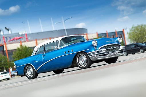
 I stumbled across the fact that the Model T Ford sold for $850 back in 1908 which is around $21,000 when adjusted for inflation. If you waited till 1916 to buy the Model T, the price dropped to $360 or around $7,000.
That got me to thinking about how the cost has changed over time but if the same prices were adjusted for inflation, have costs changed all that much?
If you look at this site lists the average cost of vehicles in the years from 1967 to 2016. The article gives the price of a car for that year it was released, the adjusted price in 2016 dollars and the increase or decrease in dollars making it possible to calculate the percent increase or decrease using 2016 dollars. The average costs means it is not for a specific model, just for what you might spend.
In addition, the prices listed adjusted for inflation and shown as the price might be in today's dollars to make the comparisons much easier. If students want to know what the price was say in 1950, they can use this calculator to figure it out. All they have to do is put in the amount, 2020 for the first year and the other year such as 1950 and it will tell you how much it was worth in 1950.
Both sites have enough information to create graphs showing increases in the cost of new cars either in dollars or percent increase over a specific time period. Students could also create an explanation of the increases and include thoughts of the various cars.
This site looks at how much a $15,000 actually bought beginning in 1953 through 2020. The article has the actual values, a graph showing the percent increase or decrease each year. This site is different than others because it takes time to explain how they calculated inflation rates and it gives students the opportunity to practice reading and interpreting data from graphs and tables.
Another way to look at cars is looking at the number of cars sold each year between 1951 and 2016. The original graph is a line graph but students can take time to read and interpret the data to translate it into raw data. The graph is such that students can calculate the percent increase or decrease from year to year.
So many different ways to present and interpret both graphs and tables. This can be turned into a project easily done at home using both spread sheets and word documents. Giving students the opportunity to interpret data and graphs, or move from one to the other and then create a word document to discuss it.
I honestly feel as if students do not get enough practice with graphs, either making them or reading them. These possibilities provide the ability to both make and interpret graphs. Let me know what you think, I'd love to hear. Have a great day.
No comments:
Post a Comment